CSS Box Model and CSS Layout?

Every element in CSS has a box around it, and understanding these boxes is key to being able to create more complex layouts with CSS.
What is CSS Box Model?
The CSS box model as a whole applies to block boxes and defines how the different parts of a box - margin, border, padding, and content work together to create a box that we can see on a page.
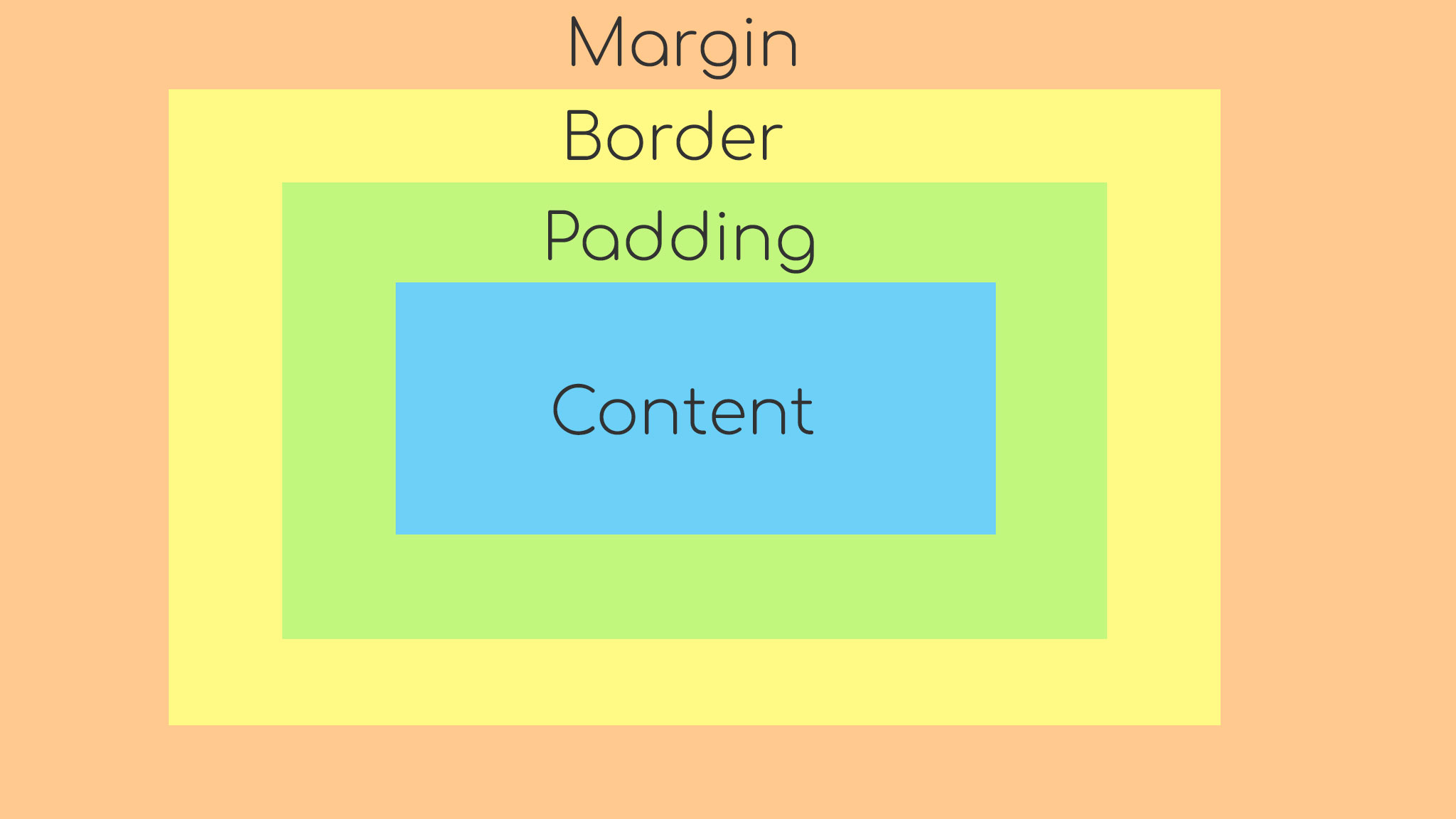
Content - The area where the actual content is displayed, width and height are commonly used properties to set the size of the content.
Padding - This is the transparent area (white space) that surrounds the content.
Border - The border box wraps the content and padding, we can set the values of border-size, border-style and border-color.
Margin - The margin is the outermost layer, wrapping the content, padding, and border as transparent space (whitespace).
What is CSS Layout?
CSS Layout plays a crucial role in defining its visual structure, organization, and responsiveness when designing a website. It is a process of using CSS to control the position and size of elements on a web page.
Positioning
Positioning is a very powerful technique used to control the layout of elements on a web page. We can easily specify the position of an element within the document flow and can also control the behaviour of elements when they are rendered on the screen.
Why to use CSS Position?
Control over element position
Positioning relative to other elements
Removing elements from document flow
Overlapping elements
Positioning relative to viewport/window
Create scroll effect
Accessibility
Different position Properties
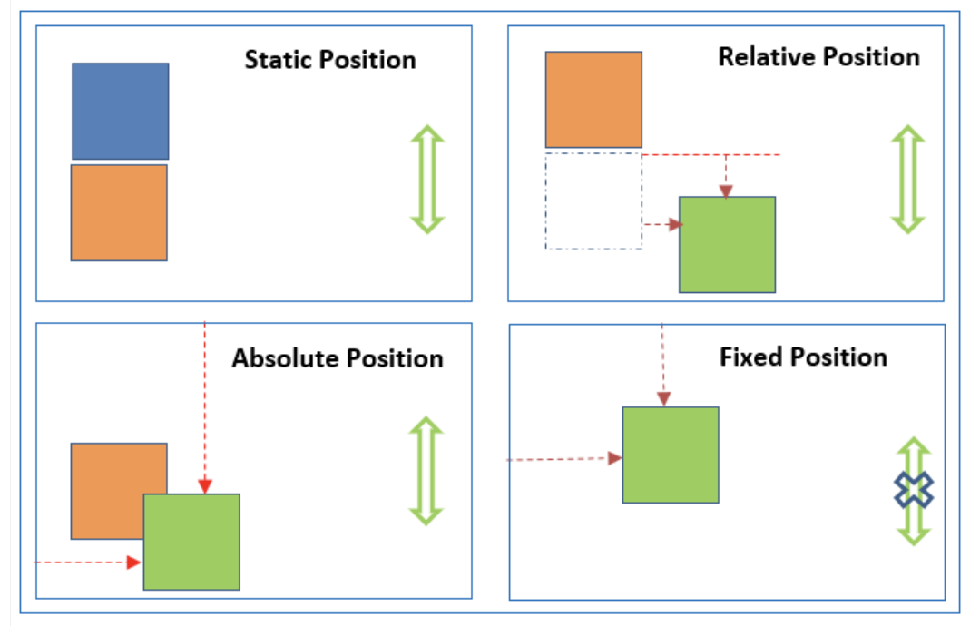
Static -This is the default position set for all the HTML elements. It will not break the normal document flow to position the element on the page. The properties like top, left, right, bottom and z-index have no effect to position the element.
Relative - The element will be positioned according to the normal document flow and will change its position according to the given values of top, left, right and bottom.The element will leave any space at its original position.
Absolute - The element will break the normal document flow to position the element on the page according to the given values of top, left, right and bottom.
The element will not leave any space at its original position. The element will be positioned in respect of its closest positioned ancestor. If there is no positioned ancestor element then it will take the document body as his ancestor.
Fixed - As the name suggests, the element will be fixed to a particular position on the page, which means the element will be at the same position always even if the user scrolls the page. The element will not leave any space in its original position.
Sticky - The element is positioned based on the user’s scroll position. It toggles between the position relative and fixed.
The following example demonstrates the types of positioning:
Flex box
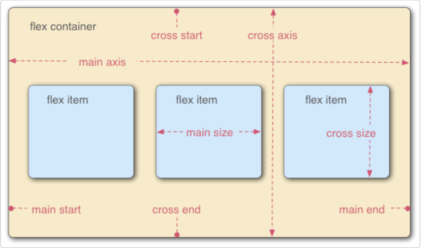
Flex box is one-dimensional layout method for arranging items in rows or columns. Flex items (expand) to fill additional space or shrink to fit into smaller spaces.
Flex box are categorised into two properties to create layout efficiently.
Flex Container Properties
Flex Items Properties
Flex Container Property
These are the properties that are used over the flex container (parent container).
display - is used to define a flex container. After defining a flex container using display; flex or inline-flex, it will enable a flex context for all its direct children and will allow users to use flex properties over the flex container and its flex items.
flex-direction - is used to define the direction in which all the flex items should be laid out. By default the flex direction of a flex container is row. There can be four values of a flex direction row, row-reverse, column and column-reverse.
flex-wrap - is used to define whether the flex items should wrap themself to fit the container width or not if the total required width of flex items are more than the flex container width. Flex wrap can have three possible values nowrap, wrap and wrap-reverse.
flex-flow - is a shorthand property for setting both flex-direction and flex-wrap properties in one line.
Syntax- flex-flow: flex-direction flex-wrap; flex-flow: row wrap
justify-content - is used to align the flex items along with the main axis of the container within the flex box layout. It has these values flex-start, flex-end, center, space-between, space-around and space-evenly.
align-items - is used to align the flex items along with the cross axis of the container within the flex box layout. It has these values stretch, flex-start, flex-end, center and baseline.
align-content - is used to align a flex container’s lines within it when there is extra space in the cross axis, similar to that of justify-content property which works on the main-axis. There should be more than one line to function the align content. It has these values stretch, flex-start, flex-end, center, space-between and space-around.
gap - defines the amount of space between the rows and columns of a flex container. gap is a shorthand property for defining the row-gap and column-gap.
gap:10px; This is similar to row-gap:10px and column-gap:10px
gap:10px 20px This is similar to row-gap:10px and column-gap:20px
Flex Items Property
These are the properties that are used over the flex items (child elements).
order - defines the order of a flex item within its flex container. We can use this property to set the position of individual flex items within the flex container.
The default value of order is 0 and the flex items will be sorted in ascending order.
flex-grow - defines the proportion of available space (size of flex container - total size of flex items) each element should take up within the container.
The value will be a positive integer (negative value is not allowed), higher the number more space the element will take up compared to the other flex items.
The default value is 0, which will have no effect on the flex growth of the element.
flex-shrink - defines that in which proportion a flex item should shrink if the flex container is smaller than the total size of flex items.
The value will be a positive integer (negative value is not allowed), higher the number more it will shrink in comparison to the other flex items.
The default value is 1, which means elements will shrink equally to fit the container.
flex-basis - is used to set the initial size of the flex items.
flex - is the shorthand property which sets the values of flex-grow, flex-shrink and flex-basis.
- Syntax- flex: flex-grow flex-shrink flex-basis
align-self - is used to align a flex item inside its flex container.
stretch:- This is default value for the align self, which stretches the element to fill its flex container height.
flex-start: The flex-item will be aligned at the start of the cross axis.
flex-end: The flex-item will be aligned at the end of the cross axis.
center: The flex-item will be aligned at the center of the cross axis.
baseline: The flex-item will be aligned with the baseline of the cross axis.
The following code demonstrates the Flex box:
Grid
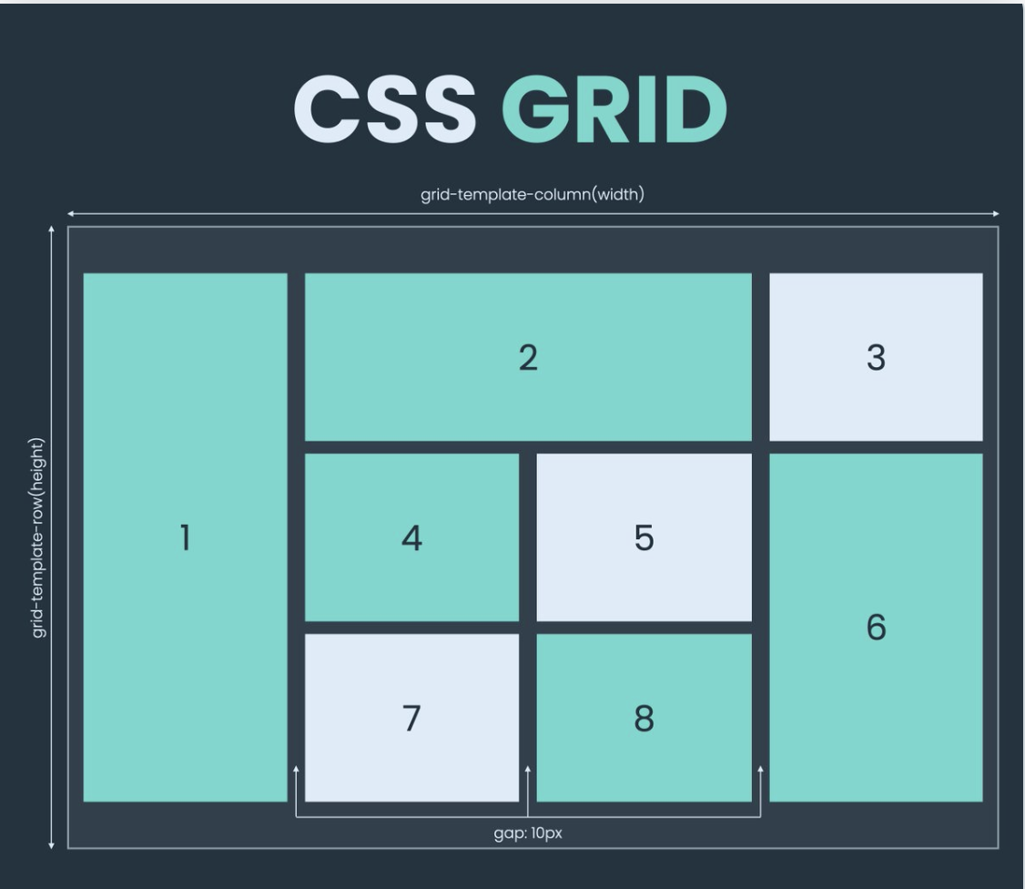
Grid is a two-dimensional layout system for the web. It lets us organize content into rows and columns and offers many features to simplify the creation of complex layouts.
Grid Container & Grid Items:
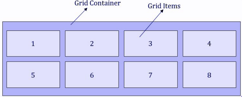
Grid containers are made up of grid elements that are arranged in columns and rows.
Grid items are actually the child elements within a container.
Properties associated with grid container
display - is used to define a flex container. After defining a flex container using display; flex or inline-flex.
grid-template-rows : It simply states the height of each row.
grid-template-columns : It states the number of columns in the grid and it can define the width of each column. Here, there is a provision to use the specification as "auto" if all columns should have the same width.
align-content : vertically aligns the whole grid inside the specified container. It can be start, center, end, space evenly, space around, space between.
justify-content : it aligns the whole grid inside the container. It can be start, center, space evenly, space around, space between.
gap, grid-gap : shorthand notation for row-gap and column-gap.
grid-column-gap is the old notation for column-gap, grid-row-gap is the old notation for row-gap.
justify-items : The justify-items property in CSS is used to align the grid items along the horizontal (x) axis within their grid cell. It applies to all grid items within the grid container.
start – aligns items to be pushed to the start edge of their cell.
end – aligns items to be pushed to the end edge of their cell.
center – aligns items in the center of their cell.
stretch – fills the whole width of the cell (this is the default).
align-items : The align-items property in CSS is used to align the grid items along the vertical (y) axis within their grid cell. It applies to all grid items within the grid container.
start - aligns the grid items to the top of the grid cell.
end - aligns the grid items to the bottom of the grid cell.
center - aligns the grid items to the center of the grid cell.
stretch - stretches the grid items to fill the entire height of the grid cell.
Properties associated with grid items
grid-row: defines on which row to place an item. You can also state here, where the item will start, and where the item will end. To place an item, you can either use line numbers, or use span to define how many columns the item will span.
- grid-row-start and grid-row-end properties in CSS are used to specify the starting and ending of an grid-item along the vertical (y) axis.
grid-column: defines on which column the item is to be placed. Like a row, here too, it can be stated where the item will start and end. Here again, you can either use line numbers, or use span to define how many columns the item will span.
- grid-column-start and grid-column-end properties are used to specify the starting and ending of an grid-item along the horizontal (x) axis.
grid-area: For the attributes grid-row-start, grid-column-start, grid-row-end, and grid-column-end, the grid-area property can be used as a shorthand.
justify-self : The justify-self property is used to align a specific grid item along the horizontal (x) axis within its grid cell.
start – aligns the grid item to be flush with the start edge of the cell.
end – aligns the grid item to be flush with the end edge of the cell.
center – aligns the grid item in the center of the cell.
stretch – fills the whole width of the cell (this is the default).
align-self : The align-self property is used to align a specific grid item along the vertical (y) axis within its grid cell.
start – aligns the grid item to be flush with the start edge of the cell.
end – aligns the grid item to be flush with the end edge of the cell.
center – aligns the grid item in the center of the cell.
stretch – fills the whole width of the cell (this is the default).
The following code demonstrates the Grid:
This is an ice cream album example code using Grid:
Media Query
Media queries are a key part of responsive web design, as they allow us to create different layouts depending on the size of the viewport, but they can also be used to detect other things about the environment your site is running on, for example whether the user is using a touchscreen rather than a mouse.
The simplest media query syntax looks like this:
@media media-type and (media-feature-rule) {
  /* CSS rules go here */
}
A media type, tells the browser what kind of media this code is for (print, or screen).
A media expression, which is a rule, or test that must be passed for the contained CSS to be applied.
A set of CSS rules that will be applied if the test passes and the media type is correct.
Width and Height
The feature we tend to detect most often in order to create responsive designs is viewport width, and we can apply CSS if the viewport is above or below a certain width or an exact width using the min-width, max-width, and width media features.
The min-width CSS property sets the minimum width of an element. It prevents the used value of the width property from becoming smaller than the value specified for min-width.
@media screen and (min-width:600px) {
  /* … */
}
The max-width CSS property sets the maximum width of an element. It prevents the used value of the width property from becoming larger than the value specified by max-width.
@media (max-width: 1250px) {
  /* … */
}
Orientation
One well-supported media feature is orientation, which allows us to test for portrait or landscape mode. To change the body text color if the device is in potrait orientation, use the following media query.
@media (orientation: potrait) {
  body {
    color: rebeccapurple;
  }
}
Here is an example of the media query, try resizing the output screen and you will see the different view of output:


